1. LinearLayout
1) 배경
- 층을 쌓는다. 오리엔테이션 지정 가능(세로방향 또는 가로방향으로 쌓아갈 것인가 지정 )
- 지금은 잘 사용하지 않음
2) 자주 사용하는 xml 속성들
- wrap_content : 컨텐츠가 차지하고 있는 크기만큼 레이아웃 크기 지정
- orientation : 지정 안하면 기본horizental임
- gravity : 레이아웃 내의 컨텐츠들의 정렬값 표기(중간 정렬, 오른쪽 정렬 등)
- background : color code, image 삽입 등, 색상 지정 시 #ffffff로 팔레트 띄우고 색 결정
- textColor: 자식 레벨에서 글자 색 변경
- textSize : 글자 크기 dp, sp 등
- layout_weight : 가중치, 부모 레이아웃 내의 자식 뷰 들의 크기 결정, 값이 클 수록 더 많은 공간을 차지함
- testStyle : 텍스트 두께나 폰트지정, 두 가지 다 가능("italic|bold")
하드코딩: 크기를 지정해버리는 것
3) 예시
- 모바일 환경 예시
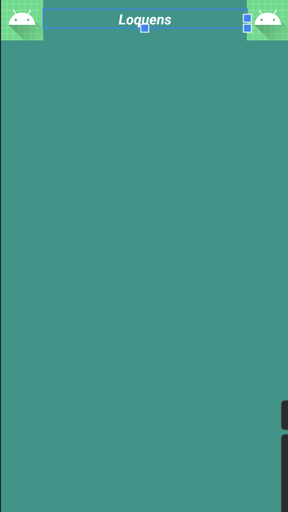
- xml 실현
<?xml version="1.0" encoding="utf-8"?>
<LinearLayout xmlns:android="http://schemas.android.com/apk/res/android"
    xmlns:app="http://schemas.android.com/apk/res-auto"
    xmlns:tools="http://schemas.android.com/tools"
    android:orientation="vertical"
    android:background="#009688"
    android:layout_width="match_parent"
    android:layout_height="match_parent"
    tools:context=".MainActivity">

    <LinearLayout
        android:layout_width="match_parent"
        android:layout_height="wrap_content"
        android:gravity="center_vertical"
        android:orientation="horizontal">

        <ImageView
            android:layout_width="60dp"
            android:layout_height="60dp"
            android:src="@mipmap/ic_launcher_round"/>

        <TextView
            android:layout_width="wrap_content"
            android:layout_height="wrap_content"
            android:layout_weight="1"
            android:gravity="center"
            android:textSize="20sp"
            android:textColor="#ffffff"
            android:textStyle="italic|bold"
            android:text="Loquens"/>

        <ImageView
            android:layout_width="60dp"
            android:layout_height="60dp"
            android:src="@mipmap/ic_launcher_round"/>


    </LinearLayout>


</LinearLayout>
2. RelativeLayout
1) 배경
- 상대적 레이아웃
- 텍스트나 위젯에 각각의 id를 추가하고 기준되는 속성의 사방에 위치 가능
- 배치 순서를 바꿔도 똑같이 동작함
2) 자주 사용하는 속성
- layout_below : 기준 속성의 하단에 위치
- layout_toRightof : 기준 속성의 우측에 위치
- layout_alignParentBottom : 부모 레이아웃 기준 하단에 배치
- layout_centerInParent : 부모레이아웃 기준 중앙에 배치
3) 실현 예제
- 모바일 환경
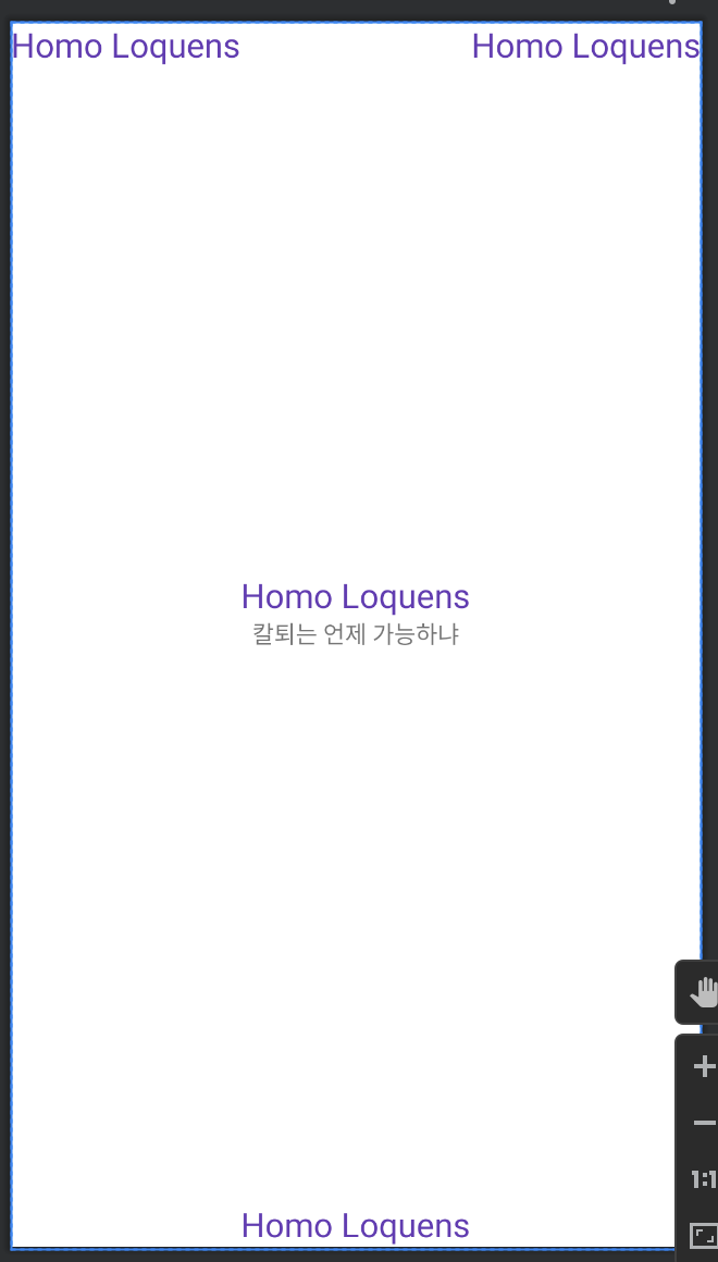
- xml 구성
<?xml version="1.0" encoding="utf-8"?>
<RelativeLayout xmlns:android="http://schemas.android.com/apk/res/android"
    xmlns:app="http://schemas.android.com/apk/res-auto"
    xmlns:tools="http://schemas.android.com/tools"
    android:layout_width="match_parent"
    android:layout_height="match_parent"
    tools:context=".MainActivity">

    <TextView
        android:id="@+id/tv_1"
        android:layout_width="wrap_content"
        android:layout_height="wrap_content"
        android:textSize="20sp"
        android:textColor="#673AB7"
        android:text="Homo Loquens"/>

    <TextView
        android:id="@+id/tv_2"
        android:layout_centerInParent="true"
        android:layout_width="wrap_content"
        android:layout_height="wrap_content"
        android:text="칼퇴는 언제 가능하냐"/>

    <TextView
        android:id="@+id/tv_3"
        android:layout_alignParentBottom="true"
        android:layout_centerInParent="true"
        android:layout_width="wrap_content"
        android:layout_height="wrap_content"
        android:textSize="20sp"
        android:textColor="#673AB7"
        android:text="Homo Loquens"/>

    <TextView
        android:id="@+id/tv_4"
        android:layout_alignParentRight="true"
        android:layout_alignParentTop="true"
        android:layout_width="wrap_content"
        android:layout_height="wrap_content"
        android:textSize="20sp"
        android:textColor="#673AB7"
        android:text="Homo Loquens"/>

    <TextView
        android:id="@+id/tv_5"
        android:layout_above="@id/tv_2"
        android:layout_centerInParent="true"
        android:layout_width="wrap_content"
        android:layout_height="wrap_content"
        android:textSize="20sp"
        android:textColor="#673AB7"
        android:text="Homo Loquens"/>

</RelativeLayout>
3. ConstraintLayout
1) 배경
- 제약을 두는 레이아웃
- 해상도에 대응함
- 개별 뷰어들의 위치를 직접 지정하기 때문에 유연성은 있으나 세세하게 설정해줘야함
- 여러 레이아웃에 섞어 사용할 때 활용도 높은 편
2) 자주 사용하는 속성
- size
> px(pixel) : 실제 픽셀, 디바이스마다 해상도가 상이해 다르게 보일 수 있음
> dp(density independent pixel) : 화면 크기를 기준으로 하여 어떤 화면의 해상도에도 비슷한 크기를 출력(※안드로이드에서 권장)
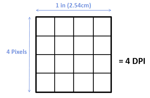
> dpi(dots per inch) : 1인치에 포함되는 픽셀을 기준으로 설정, 안드로이드는 기본 160
> sp(scale independent pixel) : 글꼴에 자주 사용되는 단위, 선택한 글꼴에 따라 다름
> in(inch) : 물리적인 길이, 1 inch = 2.54 cm
> mm(milli meter) : 물리적인 길이
> em : 글꼴과 상관없이 동일한 크기 설정
> 픽셀 참고 자료
4. FrameLayout
1) 배경
- 뷰 들을 엑자처럼 배치 가능
- 여러개의 뷰를 배치할 경우 가장 마지막에 배치한 뷰가 전면에 출력
- 디자인텝에서 드래그 앤 드롭으로 간단하게 배치 가능
2) 자주 사용하는 속성
- gravity : 자식 뷰 위젯은 프레임 내 9개 영역에서 배치 가능(top, bottm, center, right, left 조합)
5. TableLayout
1) 배경
- 뷰들을 표처럼 배치
- 표의 크기, 모양, 테두리 색 등을 지정 가능
- LinearLayout을 상속받음(속성을 그대로 사용 가능)
2) 자주 사용하는 속성
- TableRow: 열을 직접 지정 (height, weight, background)
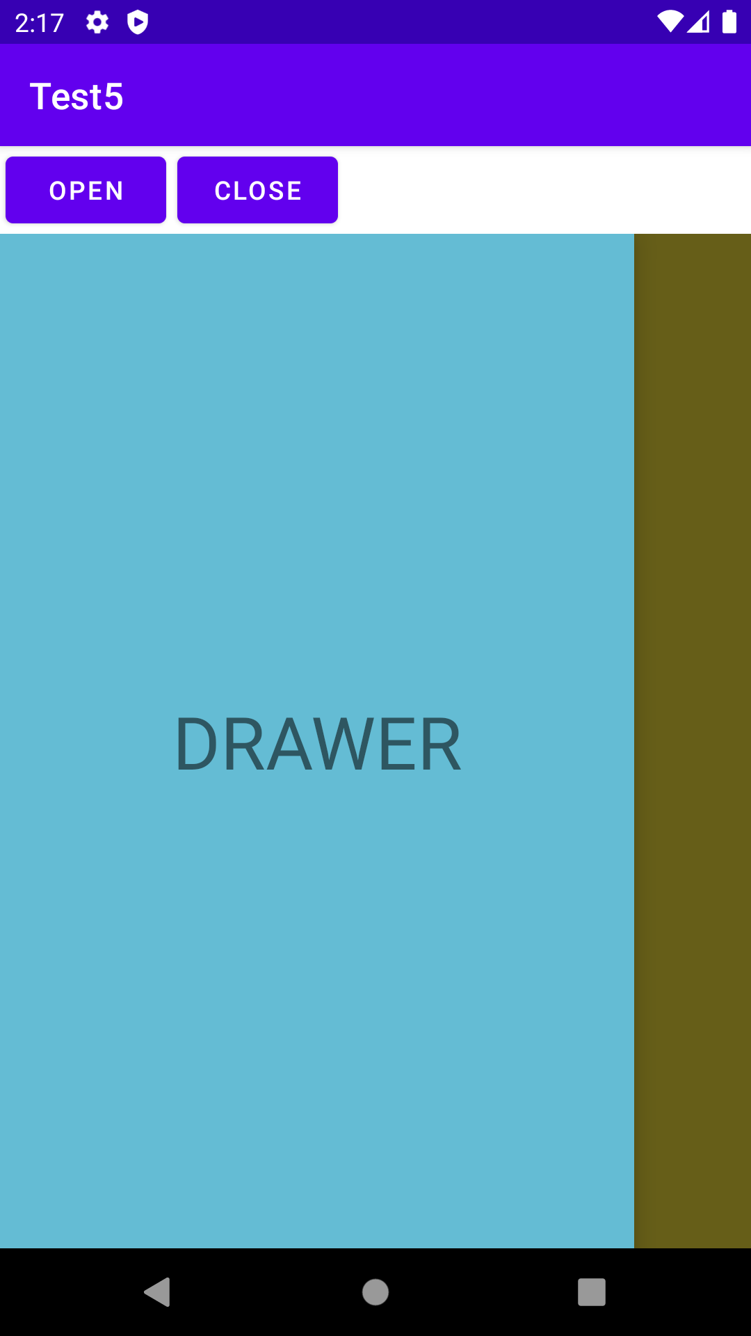
6. DrawerLayout
1) 배경
- 서랍에서 꺼내듯 배치
- 메뉴나 프로필 정보를 담는 곳으로 많이 씀
- 평소에는 보이지 않으며 슬라이드나 함수처리(버튼 클릭이나 특정 입력)를 통해 표시되게 할 수 있음
2) 자주 사용하는 속성
- 주로 match_parant로 부모 레이아웃 넓이에 맞춰 1열로 하는 경우가 많음(사이드 메뉴바)
- 예시
'Development > Android Studio' 카테고리의 다른 글
| (Android Studio) Chapter16. Life Cycle (0) | 2023.03.21 |
|---|---|
| (Android Studio) Chapter15. Log in & Register (0) | 2023.03.19 |
| (Android Studio) Chapter13. ConstraintLayout, BottomNavigation (0) | 2023.03.11 |
| (Android Studio) Chapter12. github (loading) (0) | 2023.03.05 |
| (Android Studio) Chapter11. Spinner Dropdown (0) | 2023.03.05 |

